One intersection, three competing chains… it’s an increasingly common site to see, yet it always feels like a Wild West showdown. Three brooding characters meet and one declares, “This town isn’t big enough for all of us.”
Last month, QuickChek and McDonald’s both opened new concept stores near my hometown Monroe, NJ. They chose a heavily trafficked intersection already occupied by Wawa, which opened in 2014. All three brands are evolving as they work to increase their appeal to Millennials. According to recent studies from Convenience Store News, Millennials make up approximately a third of all convenience store traffic. Another report indicates that Millennials have more than $200 billion in annual buying power.
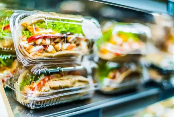
Wawa is often described as a “Millennial magnet” by CSNews; they’re known for their grab-and-go salads and health food options which appeal to younger buyers. Millennials are the largest consumers of fruits and vegetables.
At a time when people in the food industry are complaining about Millennials, QuickChek CEO Dean Durling openly admits he aspires to be one. “Millennials love QuickChek and we want to continue to market toward Millennials…So, I think if you build a store that satisfies Millennials today, it's aspirational for all of us,” Durling stated at the grand opening. “The store markets and merchandises to everyone. That is who we are and where we are heading."
So how do the new QuickChek and McDonald's concept stores stack up? Let’s start with QuickChek.

 With a pristine forecourt and ample gas pumps, this store will be a formidable opponent for Wawa. But what about the McDonald’s? I was curious to see what the more traditional establishment had to offer...
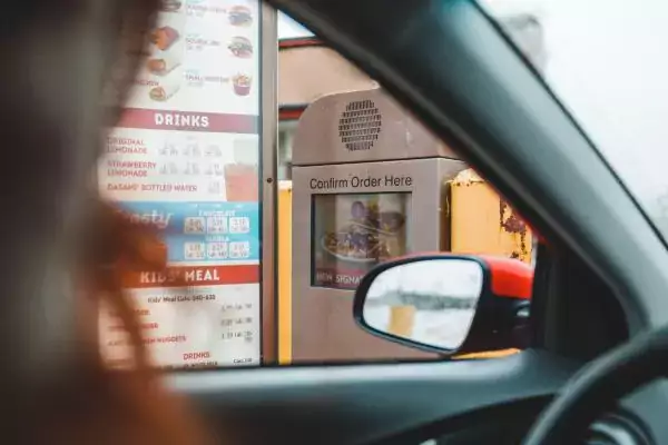
McDonald’s, like its c-store competitors, now offers a touch screen ordering kiosk. Their salads are surprisingly fresh, and they’re about to launch a mobile ordering app. McDonald’s understands how to appeal to Millennials.
The future of food and convenience retail is hands-on and highly interactive. It’s exciting to see how brands adopt new technologies to improve service and increase food options.
Located at 102 Applegarth Rd., the Monroe QuickChek is the brand’s 150th location. At 5,500 square feet, it’s a massive store that offers indoor seating counters, phone and laptop charging stations, and free Wi-Fi. The menu is full of healthy options with signage touting “clean ingredients.”
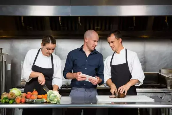
In many ways, QuickChek’s prototype has borrowed some ideas from the Wawa next door. In 2014, Wawa introduced a “kitchen-forward” design at new store prototypes, including the one built in Monroe, which I have visited in the past. QuickChek applies this concept, but I would argue that this prototype has more of a grocery store vibe than a convenience store vibe because of five unique offerings/design elements:- Self checkout at the front counter
- Standalone station with freshly prepared soups
- Indoor and outdoor seating with Wi-Fi
- Large selection of grab-and-go and prepared foods
- Wide aisles for clear sightlines
Subscribe to our blog
You are now subscribed!


